Improving Engagement in Campaign Participation by 24.67%

Improving Engagement in Campaign Participation by 24.67%

WinWinLabs | 4 Months

Overview
Overview

During the 2024 website renewal, we faced a key challenge: low engagement in campaign participation. As the sole product designer, I identified friction points in the user journey and introduced UX-focused iterations that led to a 24.67% increase in participation.

My Role
My Role

• Led end-to-end UX/UI redesign to improve campaign clarity, trust, and engagement.
• Identified user pain points and delivered targeted design solutions.
• Collaborated with cross-functional teams to align on product goals.

• Led end-to-end UX/UI redesign to improve campaign clarity, trust, and engagement.
• Identified user pain points and delivered targeted design solutions.
• Collaborated with cross-functional teams to align on product goals.

Background

Background

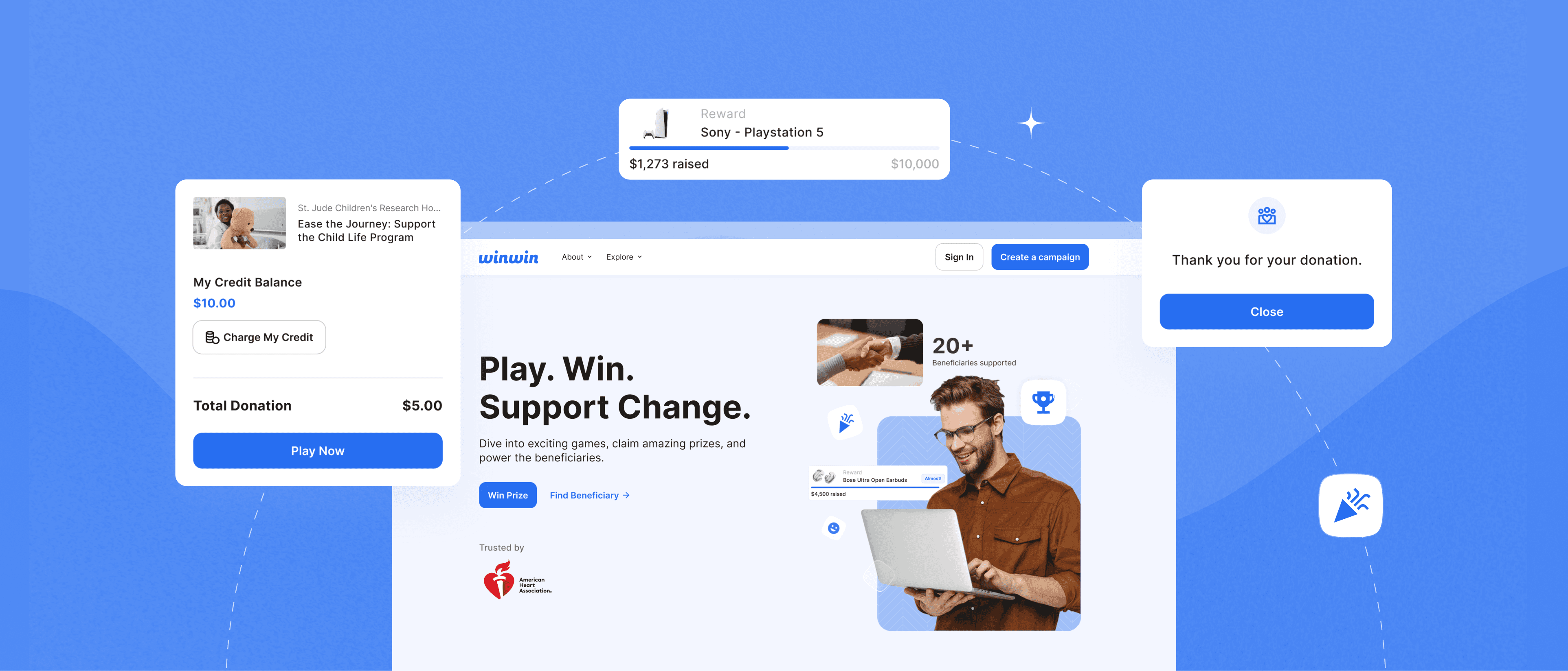
WinWinLabs is a gamified fundraising platform where users support campaigns by playing games to win prizes. Despite its engaging concept, campaign participation remained low.

Problem

Problem

01

Campaigns Weren’t Discoverable

02

Outdated Design Undermined Trust

03

Campaign Cards Were Hard to Scan

04

Fundraising Flow Felt Unreliable

UX Audit

To uncover why campaign participation was low, I audited the full user journey—from landing to donation and gameplay. New users struggled to grasp the game-based model, the path to engagement was disjointed, and a lack of visual cues made the experience feel uninviting.

Sample project image

How might we create clear and engaging campaign experiences that make it easy for users to find and participate?

Strategy

Strategy

To address low engagement in campaign participation, I focused on creating concise and emotionally resonant campaign experiences

01

Quick and Clear Information to Scan

Simplifying the campaign card layout will help highlight only the most essential details, making it easier for users to scan.

02

Emotional Connection Through Storytelling

Showcasing compelling stories and authentic visuals will foster a stronger emotional bond between users and campaigns.

03

A Trustworthy and Motivating Flow

Clarifying the message that “donating is participating” with structured forms, and upfront visuals of rewards, will build trust.

Solutions

1. Homepage: Effortless Campaign Discovery

Redesigned the homepage to prominently feature campaigns, reducing friction and enabling users to discover them right away to encourage exploration and make campaign engagement more intuitive.

Redesigned the homepage to prominently feature campaigns, reducing friction and enabling users to discover them right away to encourage exploration and make campaign engagement more intuitive.

2. Play Game to Fundraise Journey

Clarified fundraising-to-gameplay flow by surfacing key details and improving hierarchy, making the experience more intuitive, trustworthy, and motivating.

Clarified fundraising-to-gameplay flow by surfacing key details and improving hierarchy, making the experience more intuitive, trustworthy, and motivating.

3. Custom Donation: Supporting Without Playing

Reframed the custom donation option as “Support Without Playing” and relocated it to the campaign page—aligning with user intent, clarifying the difference from gameplay, and increasing donation engagement.

Reframed the custom donation option as “Support Without Playing” and relocated it to the campaign page—aligning with user intent, clarifying the difference from gameplay, and increasing donation engagement.

4. Mega Menu: Smarter Navigation

Introduced a Mega Menu to streamline browsing across categories and subcategories. Key content areas became easier to access, while contextual recommendations guided users toward featured campaigns to boost visibility.

Introduced a Mega Menu to streamline browsing across categories and subcategories. Key content areas became easier to access, while contextual recommendations guided users toward featured campaigns to boost visibility.

Impact

Impact

Through A/B testing prior to full launch, the redesigned experience led to improvements across key touch points:

28 %

Increase in campaign participation

26 %

More users engaged with the "Support Without Playing"

Reflection

Working on this project challenged me to think beyond single-product promotion and toward ecosystem storytelling—how users perceive value when multiple products are positioned together. It also deepened my understanding of how UX and business goals can align through thoughtful content strategy and design.

One key takeaway was the importance of guiding discovery not just through layout, but through contextual education—especially for users unfamiliar with the brand or product. If I were to revisit the project, I’d explore interactive elements or bundling features that help users build their own routines with more confidence.

Portfolio by Yeoeun Cho

Portfolio by Yeoeun Cho

Portfolio by Yeoeun Cho