Bobbi Brown | 2 Months
Pot Rouge Velvet Matte is a new multi-use cream blush from Bobbi Brown, designed to deliver bold color with a soft, velvet-matte finish. The goal of this launch was to create a digital experience that introduced the product to users, inspired exploration, and drove product discovery across multiple touchpoints.
• I was responsible for designing key digital assets to support the launch of Pot Rouge Velvet Matte.
• I collaborated with cross-functional teams including creative, marketing, and development to ensure visual consistency and a user-centered experience across all touchpoints.
As a new product launch, Pot Rouge Velvet Matte required a digital experience that not only introduced the product but also captured its essence through editorial storytelling. To drive product introduction and increase purchase, I was responsible for designing key assets to promote the launch on the new website.
Users are unaware of the product and need an engaging introduction, with a seamless path leading them from discovery to purchase.
How might we introduce Pot Rouge Velvet Matte to users who are unaware of it, while seamlessly guiding them from discovery to purchase?
01
Highlight Product
Use an editorial-style layout to highlight the product’s benefits and encourage engagement.
02
Visual Continuity
Maintain a cohesive visual language to enhance product storytelling for user exploration.
03
Guide Users to Purchase
Create a seamless, intuitive journey across pages for product discovery and conversion.
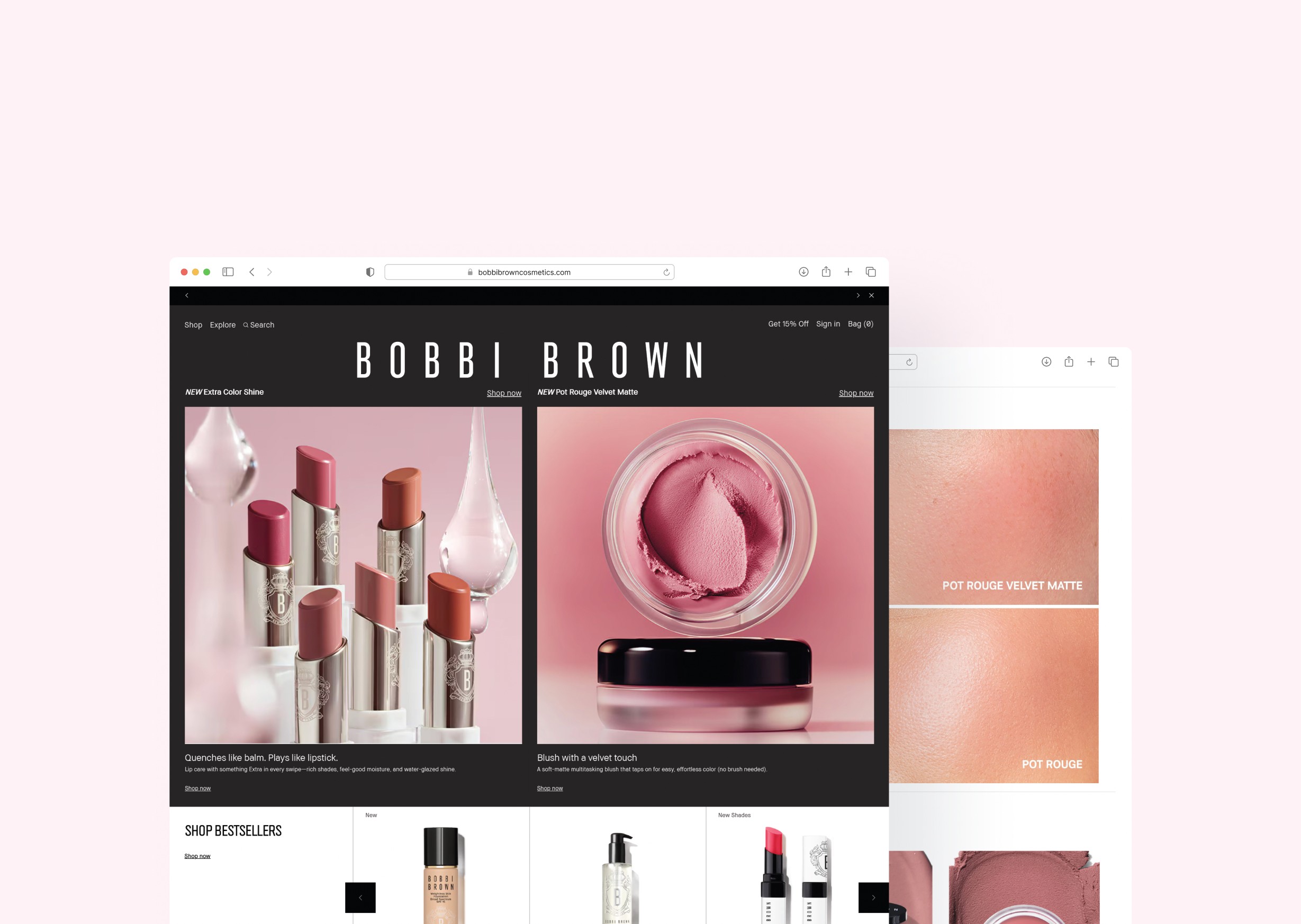
1. Homepage
2. Product Details Page (PDP)
3. GNAV
4. Promotional Modules

While exact campaign data is proprietary, similar product launches at Bobbi Brown have seen:
25 %
Increase in click-through rates to PDP
12 %
Boost in add-to-cart rate
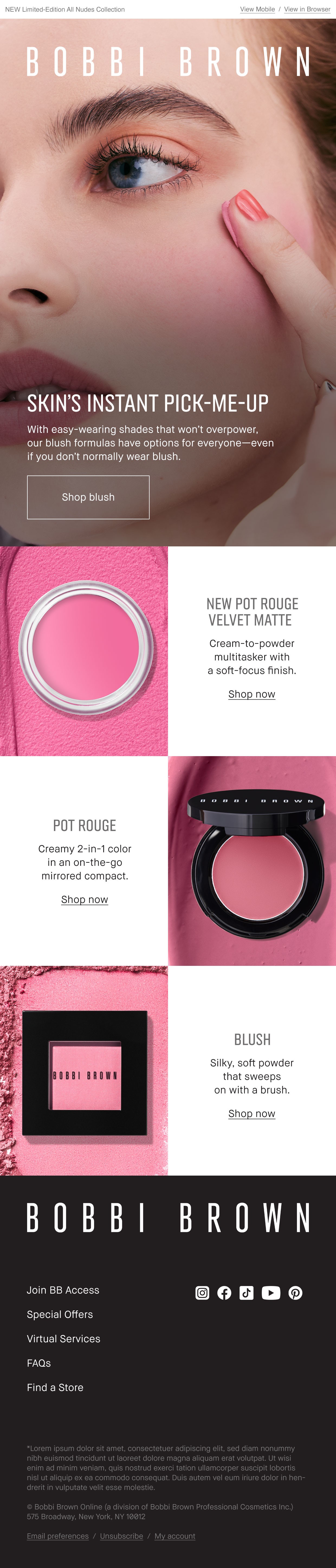
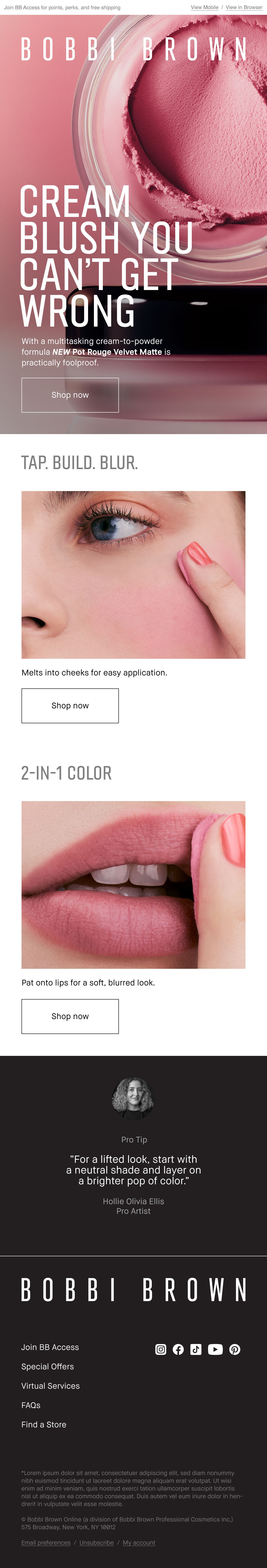
I designed promotional emails to increase product awareness and drive traffic to the PDP.
Estimated open rate: 42% (above the industry average of ~35%)